11 Colour Palette Mistakes
WEDDING MENU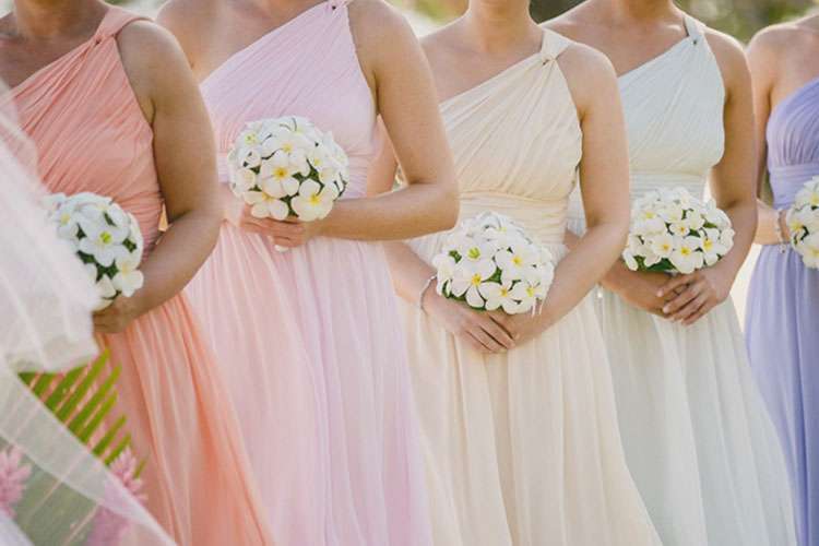
Find Your True Colours: Tips For Perfecting Your Colour Palette
We all know that planning a wedding is no easy task, so when we actually sit down and start cataloguing the fundamentals, we do our best to plot out the easier choices first. So what is the one thing that requires no prior planning, costs nothing to designate, and helps to solidify the big picture? Your wedding colours!
But hang on a minute. It may not quite be as simple as it appears. There are a few things you should be considering before picking a few hues out of the ether.
Being Trendy is so Last Year
Though it may be tempting to select a ready-made palette based on the current fashions, it may not be the best option. Yes, it all but guarantees you’ll be able to find your décor in the shades you’ve opted for, but it’s not necessarily the best solution for your design demands. Remember that when you look back at your wedding photos in 10 years, you may not be completely pleased to be staring at your bridesmaids swathed in Riverside (a dulled blue) or Spicy Mustard (just what it sounds like) – two of the top 10 wedding colours chosen by Pantone for 2016.
The important thing is that you embrace the pigments that you love.
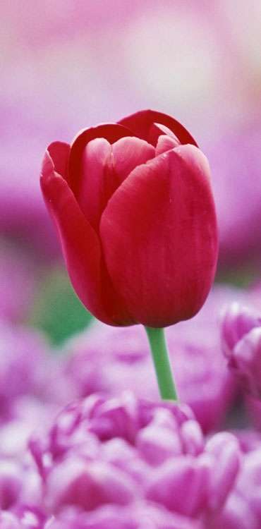
Roses Don’t Come in Neon
Being bold with colour is one thing, but choosing hues and tones not found in nature can lead to some roadblocks. Fabric comes in any shade you can think of! Flowers, however, do not. Matching your vividly hued table runners to your generically coloured centerpieces or bouquets will definitely cause unnecessary – and easily avoidable – headaches. It is most certainly possible to create a bright and bold, out-of-this-world wedding, but the challenge will most undoubtedly be out-of-this-world as well.
‘Tis The Season to be Creative
Inspiration can come from a number of sources; people, art, music, and even the weather. Selecting a colour theme to match the season creates an ambience and makes an evening unforgettable.
Let Love Be Your Muse
As it’s mentioned above, inspiration can be drawn from any source. Do you have one specific piece of furniture in your home that holds a lot of sentimental meaning to you as a couple? Perhaps you’ll garner a spark of creativity from seeing old pictures of the two of you on vacation or when you first met. What were you wearing then? What colour was the first car you owned together? The possibilities for brainstorming are endless! Sit down with your significant other and conceive a concept together.
Classic, Not Cliché
Are you quite overwhelmed yet? It can be a lot to take in, with every colour and colour combination to consider.
White is a commonly used colour in weddings, this is true; nevertheless, when used artfully, it can bring grace and class to your special evening. Most forget white’s versatility, but with the various shades offered – cream, ivory, vanilla, linen, and countless others – it can be matched with several soft shades of pink, blue, green, purple, or even used elegantly on its own with silver embellishments.

To Choose or Not to Choose, That is The Question
And the answer is don’t! (Not if you don’t want to, that is.) No matter how hard you search, you’ll never find a list of written rules regarding wedding colour selection. If your choice is to take your vows in a lush, outdoor setting, let nature be your palette. Select a neutral hue and incorporate some wild flowers for a bohemian chic vibe. Simple linens are an easy answer for the casual bride.
Décor is Hard to Ignore
Remember that, though you will be decorating your venue to transform it into a setting that harmonizes with your theme, the venue itself will almost assuredly have décor items that are permanent fixtures. Items like drapery, large wall art, and – most importantly – carpets, are elements that ought to be taken into account prior to committing to a colour concept. Some elements, particularly the larger scaled pieces, are simply not able to be covered, so being sure to work with the provided palette is a must.